

What was the problem
So I work for a company that makes adverts. A little while back, we got a new client that wanted some of the boxes in their ad to have cut-off corners. This is part of their brand aesthetic, so not something that could simply be ignored, but also something that provides a bit of a problem because there isn’t an in-built, easy way of doing this in CSS.
The ad designs had a bit of variety – a bottom left corner cut off here, a list of items with the top right corner cut off there. Some boxes had two corners cut off, but most had only one.
I decided that as a Junior QA Analyst (in my probation period), I was naturally experienced and knowledgeable enough to deal with this issue while the dev assigned the task was busy fixing half a dozen bugs I’d just reported on another similar project.
Researching ways/techniques
You can do it by moving the borders around, apparently. Another option is to simply draw a box with cut-off edges and include it in your background – though this isn’t quick or easy if you need to change it later, or QA tell you the cut-off is just a tiny bit big. I have also found the CSS border-top-right-radius Property, which I didn’t see first time around, but looks interesting/easy. Additionally – and this is the method my company used in the end – you could just create extra shapes that look like the background, and use them to partially cover the corner so that it looks cut off.
I ignored all of these, and followed the advice of an article by CSS-Tricks creator Chris Coyier that seemed reasonably straightforward. Why add lots of rubbish on top, when you can simply cut out the shape you want with clip-path? For spoilers, skip to the end to find out why this isn’t the best way to do it at all.
The code
Here is a gist for a simple page I made, or you can see the screenshots below. I still need to add the gist plugin so that I can share them within the article.
Clip-path works by taking a shape you draw using a co-ordinates style method, and cutting off anything that falls outside of that shape. We can use this to make many shapes, but more importantly here we can use it to cut off corners by making a shape that traces around the outside of the box, except for the corners.
I quickly made up an example here:

I also plugged the code into one of our adverts to see if it would just work without any extra writing, and it did. It looks pretty good, though I can’t show you as I wouldn’t want to fall foul of privacy agreements.
Let’s look at an example of the code. We can ignore most of it, eg box size and colour, text alignment etc.
For cutting off top-right corner only:

It all looks fine until you get to that block at the end, and then you suddenly feel like maybe you should do it another way, but it’s actually very simple. If you’re good at maths, then you have probably already worked out exactly how this works. If you’re okay at maths but haven’t studied it in a few years (like me), then it’ll take a bit of messing around. It breaks down into the four corners, and then down again to two XY co-ordinates for each corner, hence the eight lines. There’s a lot of 0s – that’s because I’m only using the top right corner, ie the third and fourth lines. We could get rid of one set of coordinates for each corner we’re not using, but I have kept it like this so that I can easily change which corner is cut off just by moving the numbers around.
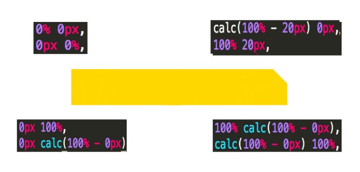
If you don’t remember it from school, XY coordinates go down the hall and up the stairs. Except in this case, they go across the hall and then down into the basement, since clip-path counts down from the top of the hypothetical graph. Let’s zoom in on the top right corner for an example:

The two lines of code represent the coordinates in our box where our corner gets cut off, at points A and B, and the two numbers on each line are the XY coordinates. For point A, calc(100% – 20px) means “go 100% to the end of the square, and then come back 20 pixels”, so for a box with width 100px, it would stop at 80px. You want to use 100% though, as it’s more flexible for when you want to resize your box, or make it responsive. The first line’s 0px is the Y coordinate, which tells it to stay at the top. Therefore, the third coordinate is at the top of our box, 20px away from the right-hand side.
Following this rule, the fourth point is on the right-hand side of the box (100%), 20 pixels from the top (20px).
You can use this method to make all sorts of shapes, cutting off more than just the corner. You could cut out a star shape or make zigzags all the way around. To be honest though, if you want to make a cool shaped button then you’re probably better off using SVG (W3 Schools SVG Tutorial).
Why it was all in vain
After excitedly realising that this method worked, I quickly messaged the dev who was handling the ad build. He did what any sensible human would do before using a method they’re unfamiliar with, and looked it up on CanIUse. You can see the results here.
CanIUse is a really good site if you haven’t found it already. It lets you see which browsers a particularly method/keyword is compatible with. IE11 is the main offender for not being compatible with anything. Anything at all.
I learned two lessons in the course of as many hours. The first is that you don’t have to know everything there is to know about coding, to code. You don’t have to know how to do every little thing before you’re allowed to make a few boxes.
 Undeveloped Bruce