

(note: this is like one of those recipe pages where the life story is at the top, recipes at the bottom, feel free to scroll past the fluff)
What is up my friends! It’s been a while, and I thought I’d kick us back off with a fun post about how I draw.
I’ve split the post into parts to show how the process differs depending on what I’m drawing and for whom – but to be honest if there’s anything I’ve learnt writing this, it’s that I don’t have as much of a process as I thought…
Before that, let’s talk about the kit.
Up until now, I’ve been drawing with a refurbished Huion GT-220 I got for an absolute steal in a boxing day sale. It was a 21.5″ tablet/monitor, where you draw directly on the screen – very fancy!
A lot of the illustrations you’ll see in this blog post, and every post before it, were drawn on that trusty tablet, and I owe it a great debt. I was able to explore and improve my art style thanks to it.
Since lockdowns began last year however, I struggled to find time to use it. It was bulky and heavy compared to newer models, and it needed to be connected to my pc via multiple cables – so it had to stay on my desk. After working there for 8+ hours every day, I didn’t want to sit at my desk to draw in the evenings.
Therefore, I saved up for an iPad and gave away the old tablet to someone who I hope appreciates and loves it. Now I can draw while watching tv, sat on a bus, lying upside down, in the kitchen, in the park… It’s much easier to feel inspired to draw now.
How I draw for the blog
I tend not to worry too much about the drawings on my blog. If you look through past posts, or even multiple images in the same post, the only consistent thing about the style is that I use some shade of red for the line art. Despite the great number of times I draw myself, a reader who doesn’t know me would have no way of knowing what I really look like based on all the face and body shapes I’ve had in the last two years, according to this site. This is because drawing takes a really really long time to do right. And if I have 4-5 images in a post, even if I only take an hour to do each one, that’s a lot of extra time to find in the week for a blog post I’ve already written and is ready to go out.
Most of the time, I’ll have an idea in my head of a few images I’d like. I might sketch them out ahead of time on scraps of paper as the ideas come to me, or I might just dive right in if I have time.
Then I’ll draw the outline digitally and colour it in with a hard, tapering brush. (I used Photoshop until recently, but the monthly subsciption model wasn’t working for me since I don’t draw things every month. Now I use Procreate!)
Depending on how well the gif above loaded, you might have spotted that when I’m colouring in the first layers, I don’t care if they go over the lines. I tidy things up and colour on top of the rough edges at the end. I then use layer masks (selecting the contents of a layer, eg ‘hair’ and instructing the computer that I’m only allowed to edit inside that area) to shade super quickly with a soft-edged brush.
How I draw ‘casual’ commissions
I call these ‘casual’, but I’m rarely casual about things I draw for others… This most often happens when I’m doing a charity drive, but also counts for drawing my friends’ DnD characters. Those who watched the 24 hour gameathon, which ended up being more drawing than gaming, will know that the process was quite chaotic.
Once I have an order, I’ll start off by finding a bunch of reference images. I used to think it was cheating to use references, because that’s what people who don’t know anything about drawing say when they catch you using them, but now I know it’s what you’re supposed to do.
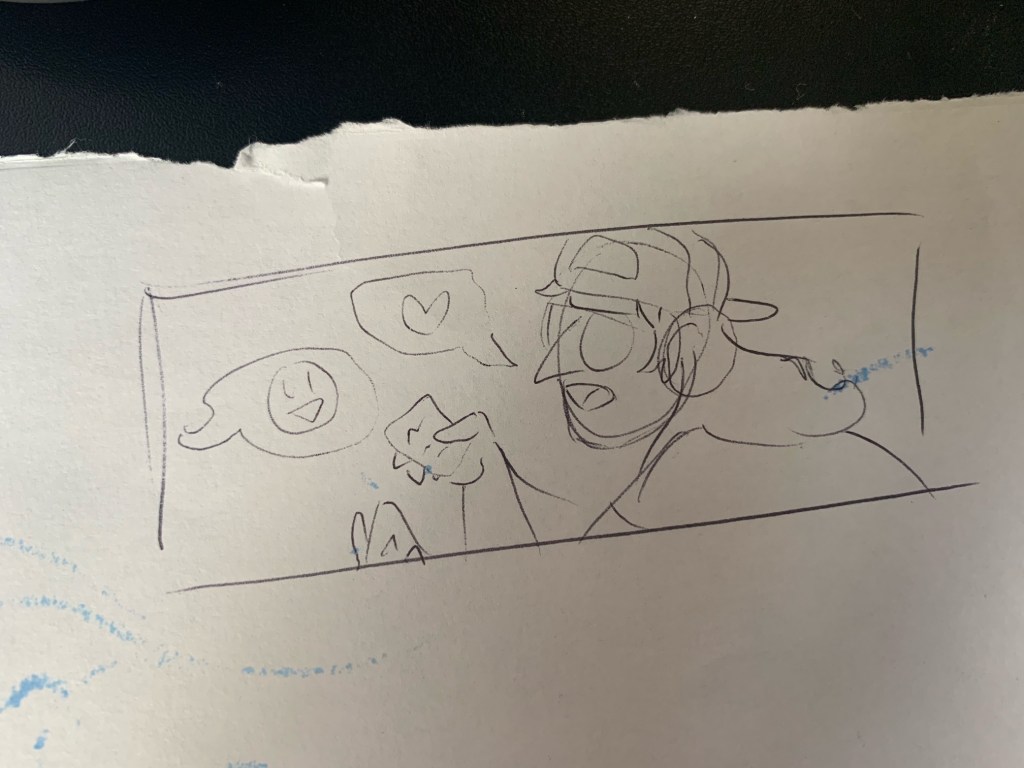
Then I’ll make a sketch:
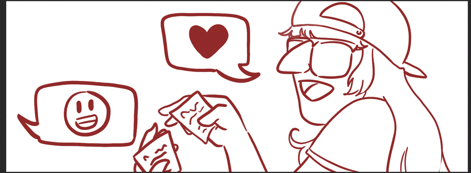
Next I’ll start the lineart, or colour blocking for a lineless drawing like the one below. Often this involves completely disregarding everything I sketched, and doing whatever I feel like at the time anyway.
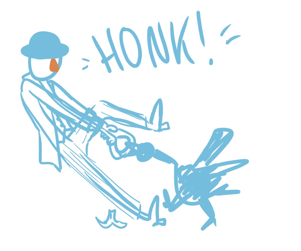
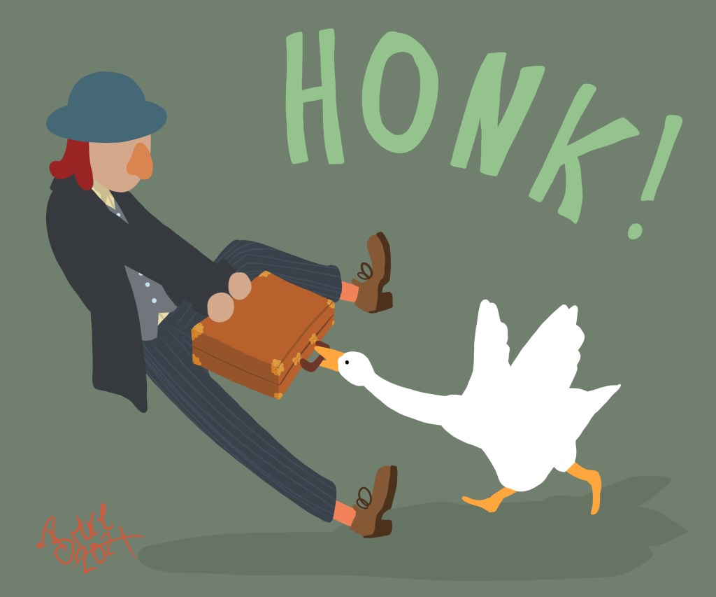
In this example the image was supposed to feel like it could have been taken right from the Untitled Goose game, so I needed specifically to draw a goose as it appears in the game. I popped in a reference image to draw over the top of, since I don’t have the shape-appreciation abilities to be able to draw it from my head. This wouldn’t be cool if I was making money from the image, but since it was for fun and charity donations, I went right ahead.
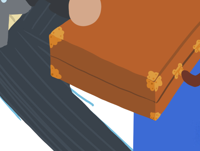
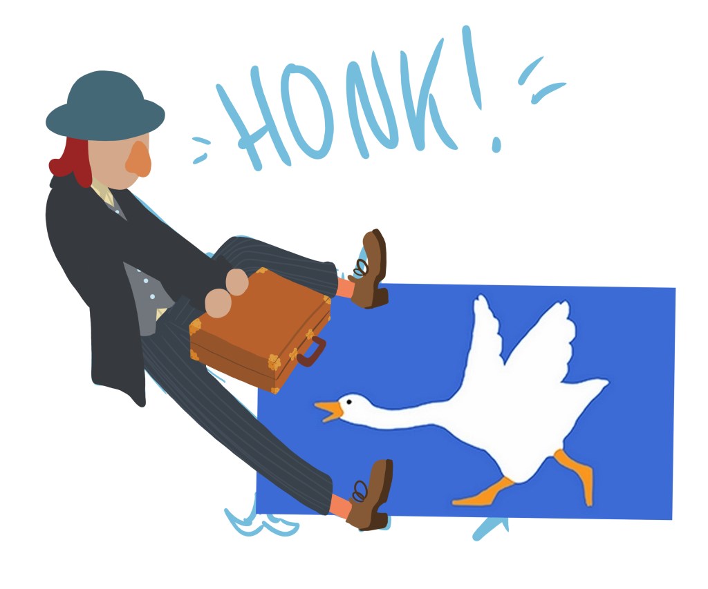
I didn’t go very deep on details, just a few bits of gold on the case, and some pinstripes. You actually don’t need many details in order to give the illusion of detail.
Here’s a sample of what the layers look like when I’m drawing. I tend to use an unnecessary number of them:
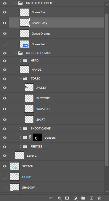
Pretty much anything that’s a different colour to anything else is drawn on a new layer, kind of like when people separate their foods. I’ve been trying to do this less, as it gets confusing and it’s easy to draw things on the wrong layers. I was pretty good at writing descriptive labels during the stream, but goodness me when no one is watching that goes right down the drain.
This was probably the most straightforward image I drew on the stream in terms of how it got from A to B to C. I was very meandering with most of them, changing poses and pinging ideas off the chat (party hat on a dalek? you got it!). Lena went away for 5 mins and came back to find that I had completely changed the layout and background of her pic while she was gone.
I also found it difficult to talk out loud about the process, because most of the time when I’m drawing there aren’t any thoughts going through my head. My hands move and I like to be watching tv at the same time (picture in picture apps are great for this, as you can watch shows in a small section of your screen without looking up from the drawing.) It’s definitely been an interesting experience to write this post, considering that I am often quite thoughtless in what I’m creating.
How I draw ‘professional’ images
I put ‘professional’ in quote marks as well, because it would stress me out too much if I was doing anything actually professional. You’ll often hear me say things like “oh I’m not an artist” or “I don’t really draw, I just doodle or whatever”. This isn’t humility: it’s a survival tactic.
But I do draw things like logos, designs, slides and illustrations for people, and they sometimes then use them as avatars, stickers, and put them on their websites etc. And when this I get a request like this, the process involves more steps and feedback.
(This is not an invitation for a bunch of random people to message me asking for drawings. I find it quite stressful and time-consuming so I only do a few pieces every now and then. Also I don’t like managing money so in general anyone who tries to give it to me will be met with silence and/or panic.)
Make sure you pay artists a fair wage, in general, in your life. But not me, never give me money for anything. I go to great lengths to avoid being given money – and if someone succeeds, I will pass it on as quickly as possible to someone else.
Commissioned Logos
I’ve drawn a surprising number of logos for someone who is more a ‘drawist’ than a designer.
Information gathering comes first: what are the requirements; where will it be used; is there any existing brand material to take into consideration? That sort of thing. Then I’ll go away and sketch a few options on paper and bring them back.
To show you this process, let’s take a look at two logos I drew side by side. One is for Danny Dainton’s Newman html reporter, and the other is for the Testing Peers podcast. Here’s the sketching phase:
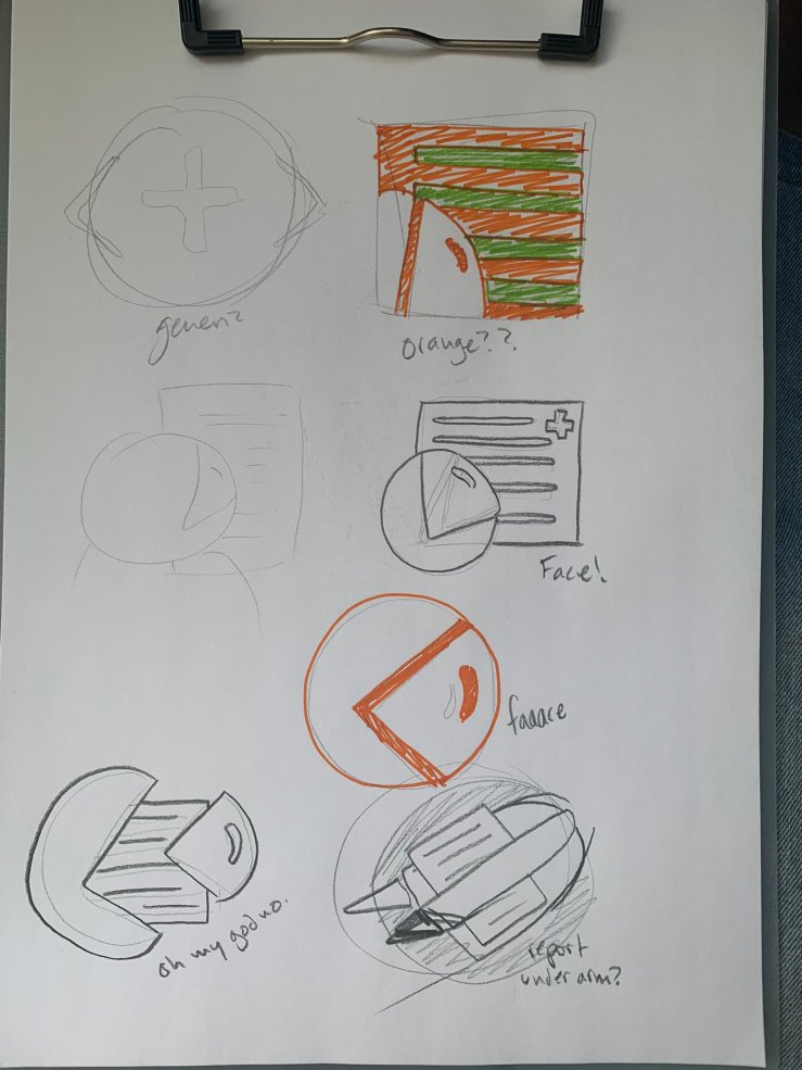
When I’m sketching, I tend to do it on normal printer paper and a clip pad, using whatever drawing implements I have to hand. This includes but is not limited to: pencils, crayons, pencil crayons, felt tips, glitter pens, gel pens, boogers, biros and markers…
The reason for doing this phase on paper rather than digitally, is that I feel more creative and free when I’m moving around or sitting comfortably. Now that I draw with an iPad, I will likely do this digitally because I can draw wherever I like now.
In the interest of honesty, I may have cheated a bit by getting carried away and telling Chris I had already started work on the design I liked most before I had even come up with any others. Then I retrospectively gave them more options…
Sometimes I just get an idea stuck in my head and I have to draw it for my own sake, so that I can move on with my life.
We didn’t go through many rounds of feedback with the Testing Peers logo, since it was a style and subject matter I felt confident in drawing. The htmlextra logo was another matter entirely…
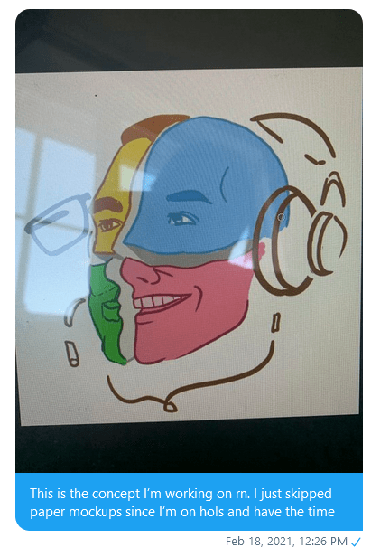
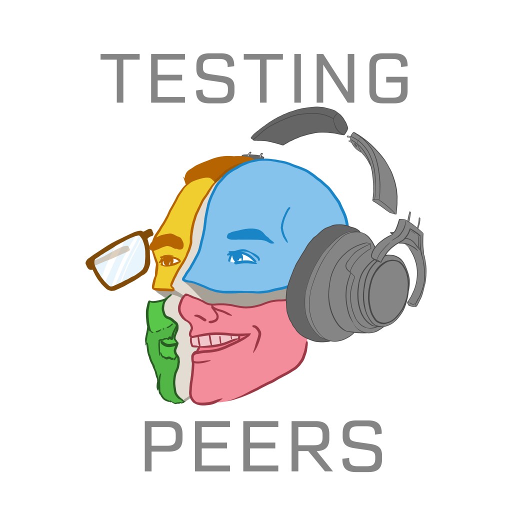
Once I had confirmation of the design from Danny, I drew the first mockup using Postman colours:

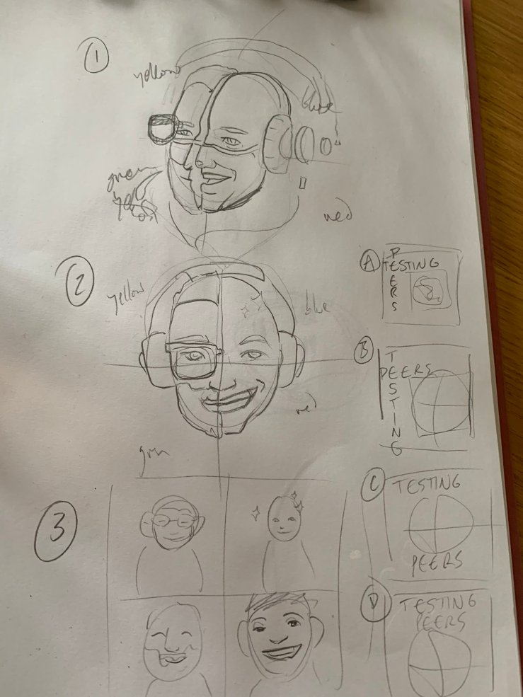
First feedback: add shoulders, curve the helmet lines and put in some text. I absolutely despise typography, by the way. It’s really where my lack of training or artistic knowledge starts to show – I don’t have an eye for fonts or text placement at all. As you can tell from what I came up with:

Second feedback: what the hell is that report supposed to be? (Not in those words.) Danny sent me a screenshot of what the reports actually look like, and I recreated one of those, which looked much better:
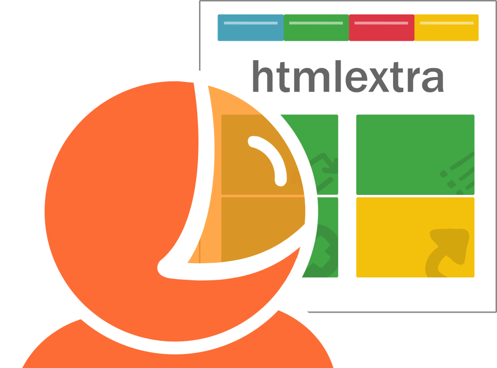
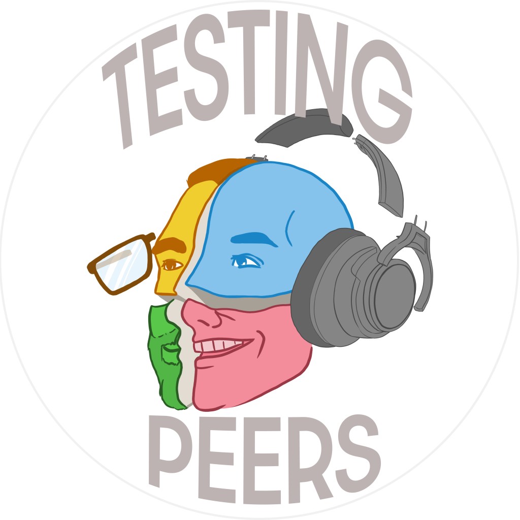
So far as the Testing Peers logo is concerned, it was far more straightforward. I gave multiple basic text options and they chose one. The biggest consideration I took when setting up the logo was that I knew it would be used on Twitter, and that Twitter makes your avatar pictures round. Therefore, anything I sent them would need to be 100% visible when used as a square or a circular avatar.
While I was drawing the logo, I placed a faint circle in the image to show where things would get cut off, and moved everything inside of it, before getting rid of the circle again.


Extra note: never draw anything for a tester…
How did you spot that, Danny!? How could you even tell!
Commissioned Illustrations
That is to say, anything I’ve been asked to draw that isn’t a logo. I’d say the process for other types of illustrations can vary wildly depending on who I’m talking to and how much work is involved with the request. I drew some slide pictures for Maaike’s TestBash Home talk recently, and since it was 5 illustrations I didn’t give her multiple options for them. I just drew one option for each as a sketch and asked if they were ok. I got the thumbs up and drew up the finals in the illustration style I felt like using at the time. It was probably about 10-12h of work in total, and if I’d done mockups and feedback properly then it would have taken even longer.
I heartily, genuinely, enthusiastically encourage you to watch the talk if you can, but in the meantime João captured the slides on Twitter:
For a fuller process demonstration, I’ll show you how I worked on the cover for the Testing Stories compilation put together by Melissa. It’s full of great stories by super awesome people: Link to Leanpub.
I started with a couple of vague ideas, but since I was asked to draw the cover only a month before it was due – and I am a slow and steady drawist – I almost immediately ran with the idea I liked best. You might be sensing a pattern, in which I draw whatever I feel like drawing. 😀 This is why I cannot be called a professional.
As with everything else, I started off with a simple sketch. At this point we didn’t know what size or aspect ratio (width : height ratio) the drawing would need to be, so I came up with an idea which could be easily made taller or smaller as required. I thought a modular design with different video panels would work well for this:
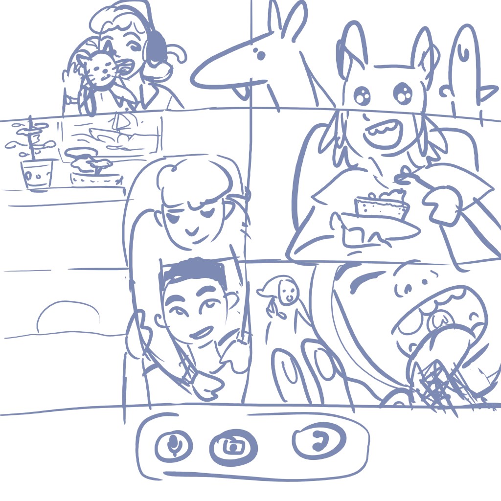
Once we had the size requirements, I added two extra panels and began drawing over the sketch by focussing on the collaboration-themed aspects of the illustration. Since lineart is the most time-consuming part of drawing for me, I decided to forego it and go lineless. This ended up being a massive mistake, and I found the drawing quite stressful since I was working in a style I was unused to. (Though the practice I put in here meant I could use the same style for Maaike’s drawings, much faster!) Those dogs are super cute, so I have no regrets.
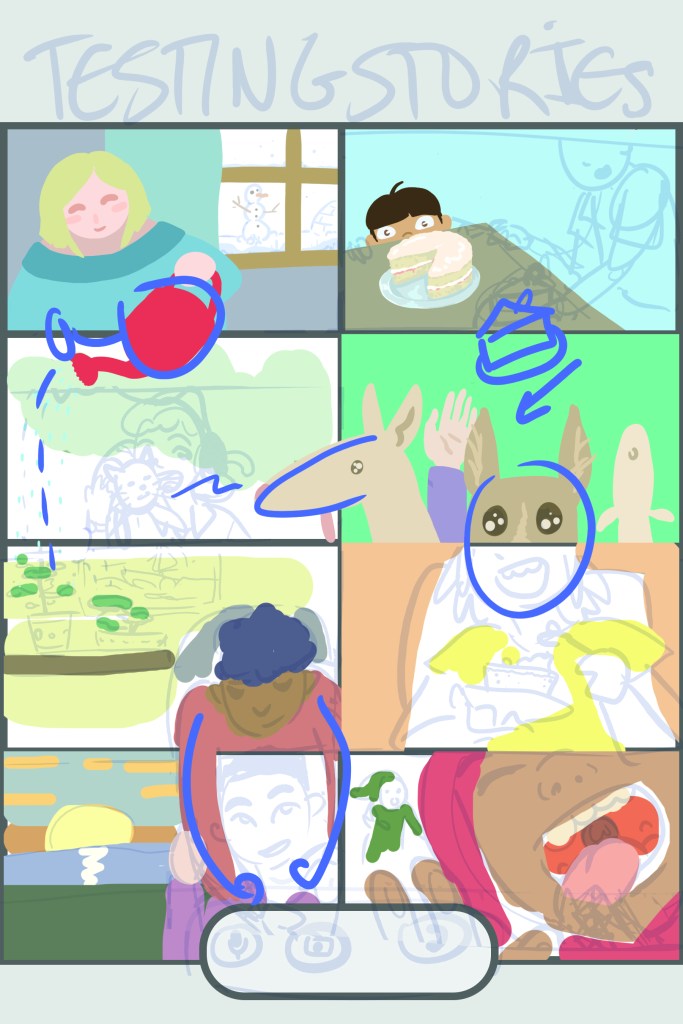
I continued to fill in the character art and backgrounds, then toned down all of the colours since the bright tones were jarring together. I’m quite proud of the little details like the bookcase, the sunset and the potted plants:
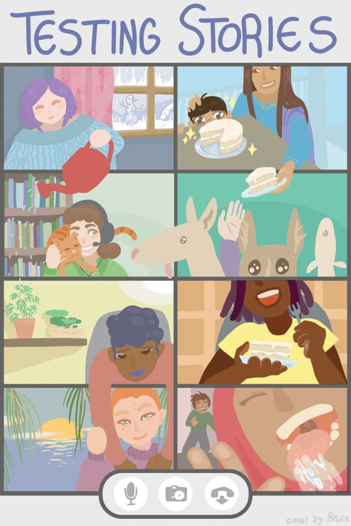
I reckon I spent over 15 hours on it because of the unfamiliar style, complexity and number of different colours in the image. Every time I added a new element, I had to subtly change everything else to make sure it stayed nicely balanced.
If I were to go back and draw that one again, I would probably simplify the concept so that it reads better when seen at 1/4 size, for example as a small preview or book thumbnail.
I’d also like to tell you about the illustration I drew for Lisa Crispin’s story in the same book because it had its own challenges – mostly self-inflicted.
I drew it with a square aspect, having not confirmed what she wanted at all because I was too excited and the timezone difference stopped me from getting feedback within 20 seconds of sending the sketch. So again I rolled with my own idea and sent an almost complete pic by the time she got eyes on the slack conversation.
The original sketch:
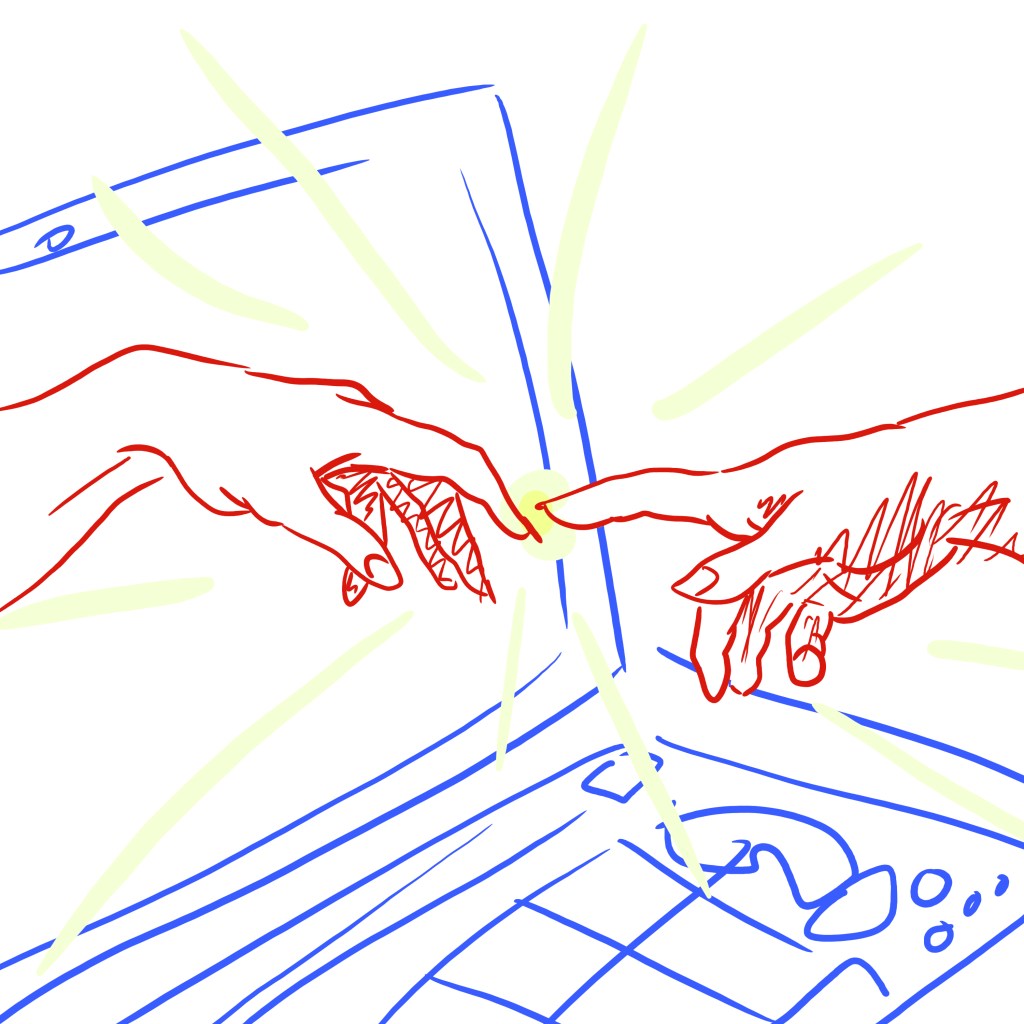
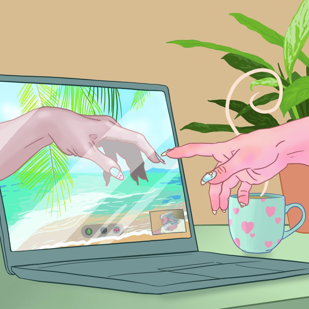
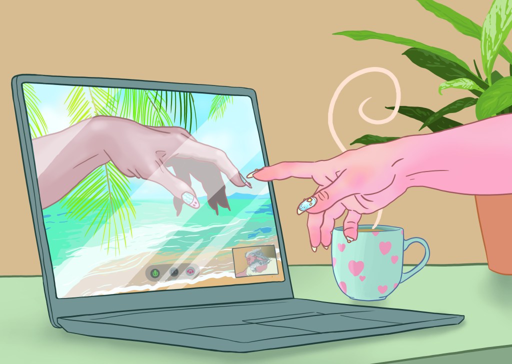
I really liked the idea of recreating Michelangelo’s Creation of Adam as if it occurred during a video call, and knew I’d use it for something even if Lisa came back and asked for something else, so it was easy to fall into hyper-focus mode. I pretty much didn’t leave my computer for 5 hours, but I was so pleased with it afterwards!
Luckily she liked it, so we were all good…
Or so I thought! Because the drawing was square aspect, it took up loads of room on the page – it needed to be a wide, short image in order to fit nicely. Thanks to my lack of foresight, I had to add blank canvas to either side, then draw the corner of the laptop and more of God’s arm, and finally adjust the composition. It was a nightmare that took an extra two hours thanks to my terrible layer organisation, and I deeply regret not thinking things through before acting.
Turned out ok in the end though. A lovely happy ending!
Moving Forwards
You’ll probably note me trying to do more creative things this year – writing, drawing, videoing – and I hope you’ve enjoyed what I’ve made so far. I have a new twitter account (@bruceonlydraws) for posting random drawings, but I’ll still post anything related to software testing on my main account, so you won’t lose out if you don’t follow the artsy one.
I’ll round us out with some blog exclusive content: a video timelapse of one of the speaker drawings I did live during TestBash Home – I had been awake for over 30 hours at this point, and my hand was throbbing with pain, but I’m proud nonetheless.
I had a ‘base face’ prepared to save time on working out proportions, but it ended up not being helpful at all so I abandoned it, and it went uphill from there. It’s really easy to make these timelapses now that I have the iPad, so I’ll share a lot more timelapses in the future!
Thanks for reading. See ya next time. Or now, on Twitter, since I live there 24/7 it seems.
